I've put together my second rough cut; shortening the sequence at the end, removing the middle section and making the music match up better. There is still some work to do but this is closer to the final product.
Tuesday, 27 December 2011
Rough Cut #2
Tuesday, 20 December 2011
Ancillary: Cover Drafts
After researching existing products I decided to start experimenting in photoshop over the past week or so to come up with some of my own ideas for my single cover.
Above is one of the images I took during filming, which I really like so I decided to build on this. I played around with the layout and where to put the text. I also wanted to emphasis the rose.Then I remembered my research and dance remix covers often have an artistic element and so I used the diffuse glow filter on photoshop which I really, really liked as it gives it a more professional and retro feel.
Then I had the idea of creating a pop art effect by using lots of different colours which will catch the audience's attention. I painted in different sections of the image but I changed the opaque settings of the colours so that you can still see the image behind the colours, which I think particularly works on the ocean.
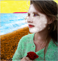
I gradually built up the colours until I only had the skin and hair left. However as you can see by my attempts below she ended up looking like someone out of Avatar so I had to have a rethink.. |
| Blue |
 |
| White |
 |
| Pink |
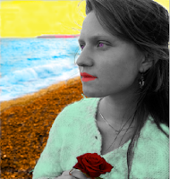
Then I had a brainwave to turn the artist black and white to contrast with the rest of the cover.
I liked this but I still wanted the bright red of the rose and so changed that as it it is symbolic of love and passion and so needs to be emphasised for the audience.
I also thought about still having some colour on the artist so I tried that out.
I also re-did the eyes and lips but I'm not entirely sure it works yet.
I also tried out some fonts that might work...
There's still some work to do on these covers but I'm happy with my progress so far.
Labels:
ancillary,
art,
construction,
cover art,
experimenting,
ideas,
practice
Thursday, 15 December 2011
Rough Cut #1: Director's Commentary
I've created a director's commentary version of my first rough cut which explains my feelings and thoughts about it and how I'd like to progress.
I'm now working on my second rough cut keeping in mind all that I've said here.
Labels:
construction,
deconstructions,
director's commentary,
ideas,
initial thoughts,
rough cut,
video
Saturday, 10 December 2011
Ancillary Research: Adverts
I've created this keynote presentation deconstructing magazine advertisements for various music albums. This was useful in studying so I could get a better idea for what I need to do for my ancillary tasks. The adverts I looked at are going to be very influential as I go about putting together my own adverts.
Labels:
ancillary,
deconstructions,
inspiration,
planning,
research
Monday, 5 December 2011
1st Rough Cut
This is my first (mostly) full rough cut of my music video. There are a few audio sync issues and I'd like to re-shoot the beginning (first 30 seconds or so), but otherwise I shall make another 'director's commentary' explaining my thoughts and changes that I'd like to make.
Thursday, 1 December 2011
End of Video: Rough Cut
I've been working on trying to match the images to the beats of the song which is harder than it looks! The end lot of beats is the longest and this is my rough cut. I'll now work on competing the other 'beat' section of the song and placing them into my overall rough cut of the entire song which will hopefully be completed by the end of the week.
I'm currently unsure whether the ending where she walks towards the camera is effective or whether I should leave it with her looking out to sea. I shall get some audience feedback to see what I should do.
Subscribe to:
Comments (Atom)


