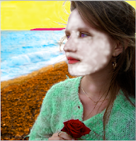
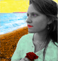
After researching existing products I decided to start experimenting in photoshop over the past week or so to come up with some of my own ideas for my single cover.
Above is one of the images I took during filming, which I really like so I decided to build on this. I played around with the layout and where to put the text. I also wanted to emphasis the rose.Then I remembered my research and dance remix covers often have an artistic element and so I used the diffuse glow filter on photoshop which I really, really liked as it gives it a more professional and retro feel.
Then I had the idea of creating a pop art effect by using lots of different colours which will catch the audience's attention. I painted in different sections of the image but I changed the opaque settings of the colours so that you can still see the image behind the colours, which I think particularly works on the ocean.
I gradually built up the colours until I only had the skin and hair left. However as you can see by my attempts below she ended up looking like someone out of Avatar so I had to have a rethink.. |
| Blue |
 |
| White |
 |
| Pink |
Then I had a brainwave to turn the artist black and white to contrast with the rest of the cover.
I liked this but I still wanted the bright red of the rose and so changed that as it it is symbolic of love and passion and so needs to be emphasised for the audience.
I also thought about still having some colour on the artist so I tried that out.
I also re-did the eyes and lips but I'm not entirely sure it works yet.
I also tried out some fonts that might work...
There's still some work to do on these covers but I'm happy with my progress so far.


No comments:
Post a Comment