I've created this keynote presentation deconstructing magazine advertisements for various music albums. This was useful in studying so I could get a better idea for what I need to do for my ancillary tasks. The adverts I looked at are going to be very influential as I go about putting together my own adverts.
Showing posts with label inspiration. Show all posts
Showing posts with label inspiration. Show all posts
Saturday, 10 December 2011
Monday, 14 November 2011
Ancillary: Research
As my brief is to create a promotion package for the release of an album, I need to not only include a music promo video, but to also create 2 of the 3 options...
- a website homepage for the band
- a cover for its release on CD
- a magazine advertisement for the CD
I think a website would be less appropriate than the other options as my song is a remix and thus not one single artist or band. Therefore I have decided to make a CD cover and magazine advert for it.
Today I'm going to look at existing products for CD covers to get some inspiration and ideas for my ancillary task.
Firstly, the original Adele single cover for Rolling in the Deep...
 Her album cover is similar - black and white with a simple pose and fonts...
 Her colour scheme is black, white and lime green so very simplistic which may be something I want to take on board.
There are two covers for the song I'm using...


- a website homepage for the band
- a cover for its release on CD
- a magazine advertisement for the CD
I think a website would be less appropriate than the other options as my song is a remix and thus not one single artist or band. Therefore I have decided to make a CD cover and magazine advert for it.
Today I'm going to look at existing products for CD covers to get some inspiration and ideas for my ancillary task.
Firstly, the original Adele single cover for Rolling in the Deep...


There are two covers for the song I'm using...


Other xx covers for their singles also feature heavily the colour black, but with interesting art and colours...


So far I've learned that the colour black is very prominent and that simplicity is key. I'm now going to look at some other covers that I like to see what works...
Wednesday, 2 November 2011
Postmodern Exhibition


The exhibition took you through the beginning of Postmodernism right up until (and past) it's death.

As I entered the exhibition I was greeted with this quote and a definition of Postmodernism, in that it "defies definition" but is the most controversial of recent art movements.
One way of describing it was that it is "like a broken mirror, a reflecting surface made of many fragments". It's key principles were complexity and contradiction and it "shattered the established ideas about style", bringing "a new self-awareness about style itself".


Anthropologist Claude Levi-Strauss defined a bricoleur as "someone working with 'oddments leftover from human endeavours'.
Therefore if modernist objects were based around utopia, progress and machine-like perfection, postmodern objects seemed to come from a dystopian and far-from-perfect future.
The exhibition used this clip from Blade Runner (1982) to show this change in thinking, as it dwells on the possibilities and consequences of living in a 'post-human' age.


Meanwhile the energy of the post-punk subculture was broadcast through music videos and cutting-edge graphics.


MTV was launched in 1981 (which I've looked at previously) and so the rise of music videos meant another platform for postmodernism and were vital in broadcasting postmodernist ideas to mainstream culture.
Viewers were presented with a series of celebs posturing before the camera.
There were many examples shown in the exhibition which demonstrate the wide range of musical styles in which postmodern techniques were explored from hiphop to new romantic to techno.
1982
1988
I found looking at the different music videos really useful and made me look at editing my video a little differently.
"If postmodernism means anything is allowed then I was all for it."
- David Byrne (Talking Heads)
Postmodern graphics and photography involved bricolage, fragmentation and quotation.

Peter Saville was responsible for a number of Joy Division and New Order's album art, where he used 'found' art images.
Magazines such as 'The Face' and 'i-D' produced many postmodernist covers...


April Greiman and Jayme Odgers used cut and paste to produce posters...


 |
| Andy Warhol 'Dollar Sign' 1981 |
"Money doesn't mind if we say it's evil, it goes from strength to strength. It's a fiction an addiction, and a tacit conspiracy." - Martin Amis
 |
| 'Protect Me From What I Want' by Jenny Holzer, Times Square, 1985 |
 |
| Han Dynasty Urn with Coca-Cola Logo by Ai WeiWei, 1994 |

In the permissive, fluid and hyper-commodified situation of design today, we're still feeling its effects. In that sense, like it or not, we are all postmodern now.
The exhibition closed with New Order's video for Bizarre Love Triangle (1986).
The bizarre editing effects and montage style is very influential and the symbolic images make it a memorable postmodern music video.
Friday, 28 October 2011
London Film Festival
This week I visited the BFI London Film Festival, saw three fantastic films and had a brilliant experience which has inspired me greatly as I go into the editing stages of my music video.
 The films I saw were Breathing, Martha, Marcy, May, Marlene and Trishna; all very different.
Breathing was a 'quiet' film but was meticulously edited with fantastic sound detail, making me think about the importance of good cutting between shots to give it a good pace and a strong impact.
Martha Marcy May Marlene looked at dreams and reality and had a hazy quality, with flashback elements - an effect I'm looking at having in some portions of my video.
Trishna was a world of colour, light and movement, but the focus was on the main female protagonist, and her subtle expressions were what carried the film. How my female protagonist is represented is something I have looked at and it is very important to get the right balance between relatable and also being a 'pop star'; being professional on screen.

I've taken a lot away from the experience and has made me look at my video differently and how I can improve it.


Tuesday, 11 October 2011
Inspirational Shots
On Saturday I came across the below video which featured a female in beach and forest locations. The way she was acting, and many of the shots are similar to how I envision my video. Therefore it is very inspirational, and during my second beach shoot on Sunday, I was trying to emulate its characteristics and will definitely have it in my mind while shooting the forest sequences on Sunday.


 Another way for it to feel more personal and connect with the audience is to do extreme close ups in slow motion. I like this shot as she looks down and closes her eyes. I think it looks really good and artistic and am looking forward to imitate on Sunday.


When it comes to the editing process I may try some of the editing techniques in making the shots lighter (brightening the image) as it gives it more of a nostalgic feel, which is similar to the home-movie style that I wanted for some of the video.
Here are some of the shots that I like from the beach location...

On my first shoot, I did similar angles and direction to those represented here, including close ups.

Also I had my artist spin on the beach, as I thought it fitted conventions. This clearly reaffirms this.
And the forest location...


While running through the forest in this video relates to the title/lyrics, I had originally wanted this also as it makes it feel more ethereal and personal.


When it comes to the editing process I may try some of the editing techniques in making the shots lighter (brightening the image) as it gives it more of a nostalgic feel, which is similar to the home-movie style that I wanted for some of the video.
Saturday, 1 October 2011
Critiquing Existing Products: Dance Videos
Today I'm going to look at four music videos, some of which are of the dance genre, as well as others which feature inspirational techniques or locations...
Firstly I am going to look at Sunlight by Modestep.
Flashback uses the lyrics and narrative of the song to create an interesting video. As he is trying to remember what happened to night before, so the video begins in the morning, with the artist alone on a boat surrounded by polaroid pictures. Edited to the music, we see flashes of the night before, specifically following one girl, as we move from streets to a club to a boat. It is edited quickly with lots of movement and we see the artist performing as well. I like the 'flashback' element and the use of the polaroids - a reoccurring motif. There is a lot of red lighting which is inspirational as I'm hoping to have my video toned blue.

Rizzle Kicks' video for Down With The Trumpets is is much more informal and features part of a beach location, so is interesting to look at as one of my locations is also the beach,
 Seeing them both on the screen and holding it at the same time is a nice touch, that, combined with the music and lyrics gives the video a clever, cheeky and fun feel to it: then cutting to them outside fives it an edgy feel. As urban artists it is unusual to film the video on Brighton streets/beach and not on some shadowy streets or in a club.
The bright lighting and British retro edge make it more fashionable, mainstream and accessible to everyone, whilst standing out from the rest of the urban market. The stereo/tv is a reoccurring motif that works well.
The artists are very expressive with fluid facial expressions, movements and lots of dancing- contrasting with Calvin Harris who is very serious throughout Flashback.
Jump cutting and repetition is used in front of the beach huts as some young guys dressed in urban clothing dance quite cheesily, indicating that this is obviously meant to be a little ironic and not to be taken seriously. Slow motion and clever editing make not having such a big budget, not be a problem.
There is an interesting transition and the beginning of this video, which I have looked at briefly before...


 The video overlaps the images of the artists face and shoes over night-time New York from above. I like this transition which I tried out a few days ago and will probably use in the verses in the beach and forest locations to add to the dream-like and home-movie style effect.
Firstly I am going to look at Sunlight by Modestep.
I like this video as has a great USP as it uses older actors who get up to things which young people stereotypically get up to which is interesting and funny to see and has got people talking about - a great marketing device (another similar video is Danny Byrd's Tonight).
The editing is very fast paced, matching the rhythm and pacing of the song, a common technique which I've looked at a lot.
It starts off with an elderly woman opening her curtains and making some food, but after putting on a record and letting in her two male friends, the video cuts to the more traditional club/gig scene where Modestep are performing to its typical audience of 18-25 year olds - showing that the scene is less than typical.
 In the club scenes they a shot very intimately with a lot of close ups of the decks, instruments and singer, as if you were there in that claustrophobic club, a great technique to use to make it feel more real and relatable to its target audience.
There is great use of slow motion throughout the video, which I think highlights the actions of the older characters as they progress through their day and also makes the change into real time towards the end more effective as the beat becomes much faster so it matches this. The video cuts between the typical club scenes to this narrative, which is effective in telling the narrative. The first shot of the 3 older actors doing something out of the ordinary is below.
 They then go on to shop lift, drink heavily, play poker, smoke, take drugs, trash the house, walk along the beach, drink in public, smash bottles, do shots, get thrown out, pick up girls, go clubbing (it becomes clear that they end up in the same club as the one Modestep are performing in, tying up the video nicely), watch girls pole dancing, do more drugs, dance on a boat until dawn, having a party in their garden and having the police come round.
 Overall, I think this is a funny (as this is not what you expect from the over 60's), well-shot and clever video that looks at the youth and elderly today and how they are portrayed, so has a message behind it. Also a reoccurring motif that is used is the artists logo, which is seen on the record playing and the helium balloons.
Next, I'm going to look at another inspirational dance video - Flashback by Calvin Harris.
 |
| There are many high angles used, as well as close ups of the action |
It starts off with an elderly woman opening her curtains and making some food, but after putting on a record and letting in her two male friends, the video cuts to the more traditional club/gig scene where Modestep are performing to its typical audience of 18-25 year olds - showing that the scene is less than typical.

There is great use of slow motion throughout the video, which I think highlights the actions of the older characters as they progress through their day and also makes the change into real time towards the end more effective as the beat becomes much faster so it matches this. The video cuts between the typical club scenes to this narrative, which is effective in telling the narrative. The first shot of the 3 older actors doing something out of the ordinary is below.


Next, I'm going to look at another inspirational dance video - Flashback by Calvin Harris.

Rizzle Kicks' video for Down With The Trumpets is is much more informal and features part of a beach location, so is interesting to look at as one of my locations is also the beach,
It is quite laid back and has a nice retro feel to it, especially with the tape player and huge stereo with unbuilt tv screen that they hold at the beginning. It brings a touch of nostalgia and a home-movie type feel that I'd quite like as well as building a connection with the artists.

The bright lighting and British retro edge make it more fashionable, mainstream and accessible to everyone, whilst standing out from the rest of the urban market. The stereo/tv is a reoccurring motif that works well.
The artists are very expressive with fluid facial expressions, movements and lots of dancing- contrasting with Calvin Harris who is very serious throughout Flashback.
Jump cutting and repetition is used in front of the beach huts as some young guys dressed in urban clothing dance quite cheesily, indicating that this is obviously meant to be a little ironic and not to be taken seriously. Slow motion and clever editing make not having such a big budget, not be a problem.
There is an interesting transition and the beginning of this video, which I have looked at briefly before...


Sunday, 25 September 2011
Critiquing Existing Products: Delilah
As the song I have chosen is a dance remix I have decided to look at the existing products already on the market to look at the conventions that I need to include and to gain some more inspiration.
The first thing I noticed whilst researching was that very few remixes have any videos. Browsing through UKDubstep and UKFDrumandBase's YouTube channels it is clear that only about 5% of the videos have any moving images.
Now I can take this in two ways: 1. There isn't a lot of inspiration available, so it will be hard to make a video that fits in with the conventions 2. I have less restrictions and can think more creatively about what I'd like to do.
The practical reason for the lack of videos is that a lot of the artists aren’t signed to record labels and have less money, but even then there is a lot less money in the industry due to things like piracy. Also a lot of the music produced in ‘user generated’ - a symptom of our Web 2.0 culture where anyone can make and share music. There is also much less of a need for a video now, due to YouTube and other sites like, SoundCloud where anyone can create, produce and share their music for free and where most people now consume their music.
The great thing about the genre of dance is that it is much more artistic and less literal than popular music and therefore the videos are often much more creative, thus a lot more exciting to make a video for.
Another convention that I have noticed from my research is that the videos are centered around the club culture, as this is the natural home for the music. This means that a huge amount of the videos are located in clubs or at the gigs of the DJs. They feature the DJ mixing on stage and the crowd jumping and dancing.


 It opens with some out of focus shots of buildings with their lights on as it is night time, establishing the location. This builds up the atmosphere and connotes being alone and on edge.
 The camera work is mostly hand-held which makes it feel less polished and more edgy, something which is common in the genre.

 And then as the artist sings the first few lines the camera holds on her face for a full 13 seconds - quite a long shot! It then cuts between a few different angles of the same scene of the artist walking down the street with a hood on, as she finishes the first verse.

Then in the pause between lines a few cutaways of the location are used...

 ...before focusing back on the artist as she sings again, this time from further away.
 Then as the music builds an extreme close-up is used of the artists face, meaning that the audience can have a creater connection with her and empathises with her emotions (which they can see more clearly in CU) as she leads into the first chorus.
 The video so far is much more slowly paced than videos I have looked at previously, and many of the shots use slow motion to add to this effect. It makes the dark city streets look almost dream-like, which fits well with the song.
 Then we get a glimpse of a man walking down a street - he is part of the narrative for the video and is intercut with the artist.

 ...and then to a CU using a handheld camera, as the man looks behind him. This immediately connotes paranoia, so begin to feel worried about him. Maybe the quiet streets aren't so friendly after all.
 A classic shot used in Thrillers is seeing the protagonist from behind, which gives a strong feeling that someone is behind them, watching them or about to catch up with them.

 We see people like the two men below that you would find in the city. These men are young, but as they are out at night dressed in a lot of black and have facial expressions that aren't very friendly they're meant to build up the picture of what it feels like to be on those streets. I also like how the beat of the music here fits the editing really nicely as it jump cuts as it pans across the men's faces...


 Now when we cut back to the artist there is red lighting. This could connote danger to the audience, and with the use of lens flares disorients the audience slightly.
 The camera work is shaky here as the artists continues walking, except...
 ... in this shot when she is standing down a back alley. The concrete and shadows is definitly meant to relate to the audiences living in cities who may go to clubs, as this type of music would be played in those settings.
 Canted angles are used here as well, which suggests instability and gives it a more raw feel and, again, adds to the dream like atmosphere.
 The camera moves closer in on the man as we cut back to his narrative, signalling that the 'threat' has become more imminent. He walks in slow motion so every action is exaggerated making it look a little eery.
 A dog then comes into shot out of the shadows, which is quite intimidating.
 Then the camera movement becomes more interesting. As the artist is standing in the alley she has her hands out to her sides touching the walls. The camera moves around, twisting up, down and around making the audience feel a little disorientated and uncomfortable. This could be connoting how it feels to walk down the city streets at night if they all look the same.
 The dog then appears again this time with a brighter light on him. He is looking out away from the camera as if ready to bark or attack if anyone comes near. The spikes on his collar adds to this effect.
 We then get a CU of the mans face again this time as he looks over his shoulder, another classic paranoia shot. His face is light up but the background is in shadows and his face is worried so you can empathise with how he feels.
 In the pause between lyrics we get a cutaway of a lamp-post with lens flares adding to the artistic feel of the video and retaining the location of the city at night.
 We see the artist again as she continues to sing this time in a more lit up area, but still with shaky camera moves until she stops to focus on the end of the line...
 ...which then cuts to her back in the alley as she shows some more emotion.
 It then cuts to an extreme close up of the artist playing with her hair - an angle we haven't seen since the beginning. It is also an opportunity to show off her jewellery - similar to what the target audience would wear or want to emulate.
 The pacing is a little faster now as it builds to the last chorus. I like this shot above as it shows the artist clearly in the light with shadowy surroundings but with the silhouetted outline (perhaps on a poster?) or a woman which could reflect how the artist feels - being in the shadows. And also shows how everything looks different under the cover of darkness and that even an ordinary poster can seem more sinister.


 These next few images show the different angles, lighting and locations the artist is in for the next few lines of the song. So far the artist has been pretty sombre and intense but she begins to smile now as the message of the song may be more positive.
 The dog returns, this time walking down the streets on its own - even more scary as there is no human to control it. This could connote how there are 'animals' on the streets that could harm you every day.
 We see the man again, looking over his shoulder. As this follows the shot of the dog this could suggest that he is scared of/running away from the dog.
 There is another shot of a street light. It is obvious that this video is very much focused around lighting and it is used in good effect to great a great atmosphere around the song.

 We see the artist walking again with the hood pulled over her face. The artist has worn the same costume throughout the video of a dark hoodie pulled up onto her head. This usually signifies that you don't want to be seen or can even imply status and power. Correlating with the unusual sight of a deserted city street this could mean that she either shouldn't be there alone or heightens that feeling of being frightened and alone that the audience can sympathise with.


 This next part of the song focuses on editing to the beat, an extremely common convention of contemporary music videos. This shot starts off at her side and jump cuts up to her profile and then to her facing the camera. It then cuts to an extreme CU of the artists lips...
 The camera is steady as she lip-syncs a few of the lyrics and then cuts to a more fast paced, shaky camera work with the red lighting on the artists face once again...
 The camera tracks her as she does different arm gestures including moving her hand to the top of her head. There are lens flares again, making the image more pleasant and artistic to look at as well as more professional. The camera goes out of focus and pans down to her hand at her side.

 We see the dog again and what appears to be the same shot of the man looking over his shoulder - repeating the same shots creating a visual motif for the video.
 Then the editing gets a lot more exciting as the beat of the song very suddenly quickens, so the editing becomes extremely fast as we see flashes of the artist in the various poses and locations of the video so far...
 ...ending with the shot above.
The editing remains reasonably fast as the song climaxes and the artist becomes a lot more animated in her lip syncing.
 The camera movement, however, remains canted and disorientating as she sings in the alley.
 We see the dog, silhouetted in a light up doorway, this time running (albeit in slow motion) so a lot more intense.
 This is then paralleled with the artist walking in slow motion past a light up doorway also. The dog is seen again, now just walking in slow motion and the man is seen, his face in shadows...
 However this time as he turns around his facial expression changes...
 And then we see him, for the first time in the video, running.
 He looks over his shoulder once again, and then quick as a flash...
 ... he seems to run into a road...
 ...and the bus apparently runs him over.
 This is an odd ending to the narrative, and I'm not sure what the audience is meant to take away from it. The literal message is that if you get paranoid over dogs following you then you'll get run over by a bus. Or the more symbolic message could be that there is no reason to be scared of the city at night?
 But as the camera cuts to the artist who appears to have witnessed what just happened and is almost smiling and then cuts to the final shot of the video with the artist holding the lead of the dog walking away into the night in slow motion in the abandoned streets of the city, the entire message of the video so far can begin to be questioned. The odd tension and paranoia that the man got from the dog may not have been unjustified and could be signifying that the artist herself was behind it. Or the last shot could be the artist trying to steer the dog away so it doesn't do anymore harm. I'm not completely sure. What I am sure about is that the video leaves you thinking and is dark and edgy.
 As the shot fades to black a police car can be made out, turning a corner heading towards, I suppose, the scene of the 'accident'.
 After looking at Delilah's video it has reminded me that a lot of dance (and the surrounding genres) videos are set in urban locations. From 3:47 to 4:06 I am featuring urban locations in order to fit in with this convention. It is hard to set the entire video there as I live in the countryside, but I know it is important to get an urban element into the video as dance music connotes cities and the underground.
The first thing I noticed whilst researching was that very few remixes have any videos. Browsing through UKDubstep and UKFDrumandBase's YouTube channels it is clear that only about 5% of the videos have any moving images.
Now I can take this in two ways: 1. There isn't a lot of inspiration available, so it will be hard to make a video that fits in with the conventions 2. I have less restrictions and can think more creatively about what I'd like to do.
The practical reason for the lack of videos is that a lot of the artists aren’t signed to record labels and have less money, but even then there is a lot less money in the industry due to things like piracy. Also a lot of the music produced in ‘user generated’ - a symptom of our Web 2.0 culture where anyone can make and share music. There is also much less of a need for a video now, due to YouTube and other sites like, SoundCloud where anyone can create, produce and share their music for free and where most people now consume their music.
The great thing about the genre of dance is that it is much more artistic and less literal than popular music and therefore the videos are often much more creative, thus a lot more exciting to make a video for.
Another convention that I have noticed from my research is that the videos are centered around the club culture, as this is the natural home for the music. This means that a huge amount of the videos are located in clubs or at the gigs of the DJs. They feature the DJ mixing on stage and the crowd jumping and dancing.


The reason for this is that they contain the target audience of 18-25 year olds that listen to this genre of music and go to this types of settings, meaning they relate to the locations. Unfortunately these settings aren’t available to me so I’ve had to think more creatively in order to still retain the dance element in my video. What stands out in these videos is that they still have the editing techniques I have been looking at and will have in my video. I will look at other genres to inspire me on how to make a music video, but will try and keep the lighting, colouring, costumes, editing and overall tone of the video conventional to the genre of dance.
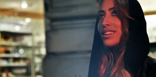
Next, I'm going to look at a particular video and critique it. I have chosen Go by Delilah as it she is a female artist and it is of the dance genre. I am interested to look at how she is represented.
The video is set on some quiet city (London?) streets with the artist walking down them.


 |
| This low angle makes the artist seem bigger and connotes power |


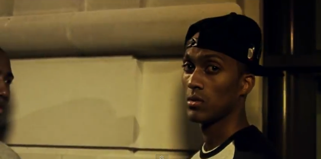
It cuts to an alleyway, which we see the man entering...


Then it cuts back to the artist as she interacts with the location with great lighting. The lighting used in the video is mostly related to city street lighting from buildings and lamp-posts to give it a more realistic feel. They use the shadows well making for a tense atmosphere heightening the paranoia of the man.


The editing remains reasonably fast as the song climaxes and the artist becomes a lot more animated in her lip syncing.


Also deconstructing this video has made me think that setting the video at night might give it an edgier feel. It will also give it a more unique feel as well as fitting better with the conventions of dance music videos, seeing as I can't have many urban locations due to the practical issues discussed above. I will need to think now about a shooting schedule to fit around this new night time idea as well as organising when my actress can be free to film.
Subscribe to:
Posts (Atom)