Showing posts with label cover art. Show all posts

Friday, 23 March 2012

Evaluation: Q2

2. How effective is the combination of your main product and your ancillary texts?
In order for my three products to work together I had to create a house style so it would be clear to the audience that they were all linked and advertising the same products. 
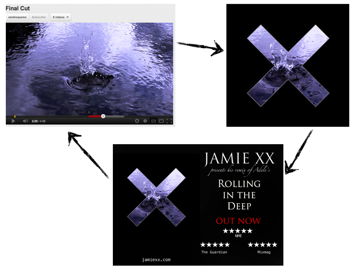
House style throughout the three texts
Images: The image of water was significant throughout my three products and was one way in which I tried to create a theme between them: it was a reoccurring motif which corresponds with the themes of the song itself. As the title of the song is ‘Rolling in the Deep’, this connoted to me water and the chaos that comes with it - reflecting the feelings of the protagonist. I’ve done this by taking a still from the video to use as my cover (which is an industry convention) that shows a pebble going into the water, part of a memorable section of the video, thus tying the two together. This splash can also symbolise the turmoil of feelings that the female protagonist is going through which is why I believe it to be a strong image in which to sell the song. 


Fonts: The fonts I used in the video itself connoted to be both youth and a more unique feeling which has impact as it can connect with the audience easier than simply using an Arial or Times New Roman font. I wanted a font that would catch the audiences eye which, corresponding with the quick editing, meant that it had a strong effect on the audience so they can anticipate the exciting video they’re about to see. 
Font I used in the video
In my ancillary I wanted to create a feeling of the artist being established as he is a relatively unknown artist but wanted the audience to trust him. I used relatively formal language and a simple layout to create a confident feel in the advert. Having no words at all on the cover was a risk but, as it is in keeping with the Jamie xx brand that he has already built up, it was the best way as his audience would then recognise that it is Jamie xx’s single and thus would already have a knowledge of his genre and quality of music.


Colours: The blue of the water is the dominating colour in my ancillaries which is complemented by the black and white base colours which connotes chic and sophistication. Black, white and red are the most common colours used in the music industry and so I used red to highlight the ‘Out Now’ feature of the advert which draws the audience’s attention to the fact that it is available to purchase.
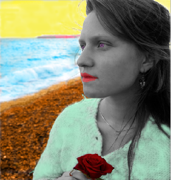
I also used black and white in the interlude section of the video to contrast with the colours in the rest of the video. The black and white symbolised the serious emotional side to what she was saying and feeling in that section and so audience feedback told me that black and white would work here.
audience feedback which prompted me to try it in black and white
As a music video is created in order to promote a single (something I have already discussed) I had this in mind throughout the production process of both the video and the ancillaries. I included the jamie xx website in my advert as the 21st century is all about multi-platform media and so the audience (particuarly the target audience of 16-24 year olds) will definitely expect an internet presence which they can interact with and find out more, hopefully leading to buying the single. I shied away from featuring jamie xx’s facebook page or itunes as jamie is known for being a cool and elusive guy and thus simplicity in that case is key, leaving an air of mystery. 

Here is a video featuring many audience members being asked about my three texts...

Saturday, 25 February 2012

Ancillary: Final Advert

I made two advert drafts to decide which one to use as my final ancillary. I wasn't sure about the placement of the reviews and so asked for feedback on facebook, which was very helpful.
Here are the two adverts...
Advert #1
Advert #2
Here's some of the feedback I got on advert #2...


Therefore advert #2 is now definitely going to be my final advert which I'm very pleased about. I think that it reflects my audience research and the tone of Jamie xx's music as well as tying in with the music video I have created. 

Thursday, 16 February 2012

Ancillary: Final Cover

I've been through many experimental stages with my single cover for my ancillary task, from using an artistic, colourful approach to using jamie xx's real single covers as inspiration. I now think I have landed on an effective, simple design that effectively promotes jamie xx's single. The research I carried out before beginning my work was invaluable as it meant I had a good understanding of what is needed in a single cover and how much they have evolved. I used the discovery that many artists (especially dance artists which is the genre I'm working in) use a still from their video as the art for their cover to fully create a house theme in their promotion for the song, as basis for my final draft. 
Before settling on my final cover I looked one last time at trying to incorporate my female protagonist into the cover...
But, once again, I think it fails to grab the audiences attention and the cover that I eventually chose not only has an artistic feel to it which fits in with the jamie xx brand but also features water and so interlinks with the concept of 'rolling in the deep'. 
Here is my final cover...

Thursday, 12 January 2012

Ancillary: Cover Drafts Continued

I've been looking further at my cover artwork and have now created some more drafts.
Firstly after showing my last draft to some people they suggested to look at the fonts and colours. So I decided to change them around a bit to see if it worked better...
I like the idea of matching the colour with the rose to highlight that better. Red connotes love and passion as well so would help to signify what the song/video is about. I liked this better but then I had a great idea!
Jamie xx's existing covers uses The xx's 'X' logo and so I thought I'd play around with that as audience's who know Jamie xx's work are used to seeing this logo on his work and so it's easy to spot his music. 
As you can see putting it directly over the top of what I've already done doesn't work at all and so I tried moving the layers around...
I wanted to retain the element of the rose so I tried moving it so you could see her eyes as well as have the rose but I still wasn't sure.
Then I thought that as the song is called 'Rolling in the Deep' I could use the ocean portion of the image and have the rose...
...but that didn't really fully work either.
Then I thought about all my research I have done in the past. I remembered my Videos and Cover Art post I'd done and how I'd looked at dance artists who had used stills from their videos in their cover art, thus creating a really strong house style. 
I then looked through my video to find some strong images that might sum up my video and so created this draft which I really like as it has the water element...
I also used the original image of the artist and put the effect of 'diffuse glow' on which I had looked at when I first started experimenting which I also like as it has an alternative feel which matches the genre of music while also having a photograph of the female protagonist from my video. 
My cover from the top is perhaps more mainstream with an urban edge with the colours but the covers with the X maybe fits the conventions of a dance remix and definitely of Jamie xx the artist. 

Thursday, 5 January 2012

Ancillary: Audience Feedback

I have shown these two versions of my covers to my class to work out which way to go...
Colour
Black and white
2 people liked the first cover with the coloured lips and eyes whereas 4 people preferred the black and white artist. I was tending to agree and so now I would like to proceed with that version as I think it symbolises the mind of the female protagonist better as she is distanced further with the rest of the world and it's more clear cut, seeing things in black and white after her break up. She is also easier to emphasis with as her eyes can be seen easier and aren't as "alien" like which is what one member of my audience said.
I am also going to assess the fonts used and get some feedback on those before finishing my cover. 
Here is a new draft...

Tuesday, 20 December 2011

Ancillary: Cover Drafts

After researching existing products I decided to start experimenting in photoshop over the past week or so to come up with some of my own ideas for my single cover.
Above is one of the images I took during filming, which I really like so I decided to build on this. I played around with the layout and where to put the text. I also wanted to emphasis the rose.
Then I remembered my research and dance remix covers often have an artistic element and so I used the diffuse glow filter on photoshop which I really, really liked as it gives it a more professional and retro feel.
Then I had the idea of creating a pop art effect by using lots of different colours which will catch the audience's attention. I painted in different sections of the image but I changed the opaque settings of the colours so that you can still see the image behind the colours, which I think particularly works on the ocean.
I gradually built up the colours until I only had the skin and hair left. However as you can see by my attempts below she ended up looking like someone out of Avatar so I had to have a rethink..
Blue
White
Pink
Then I had a brainwave to turn the artist black and white to contrast with the rest of the cover.
I liked this but I still wanted the bright red of the rose and so changed that as it it is symbolic of love and passion and so needs to be emphasised for the audience.
I also thought about still having some colour on the artist so I tried that out. 
I also re-did the eyes and lips but I'm not entirely sure it works yet.
I also tried out some fonts that might work...
There's still some work to do on these covers but I'm happy with my progress so far.

Sunday, 20 November 2011

Videos and Cover Art

During my research it has become increasingly obvious that music videos and artist's covers are very much interlinked and that the themes from the song and video are transferred into the marketing. Thus it's important to make sure the single cover I make completely reflects my music video and vice versa.


Sometimes the themes are even stronger as stills from the actual video are used as the cover art. Therefore I need to make sure that my video keeps a constant in its quality. 
Cover Art
Calvin Harris has been a big influence on my music video. His video for Feel So Close has a very intense feel while being beautiful to look at and reflecting the themes of the music. It's an example of an interlinked video and single cover. I like that it's very direct and to the point and very simple - just having the title and artist name.


The themes of the song I've chosen are about a break up. The female is singing about how their relationship could have been good (suggesting she was angry over the break-up) but she's glad it's over now (implying he dumped her) as she can now see that he 'played' her and that she's much better off without him. I see this as a positive message which is why I want to make sure the song ends on a positive note. 
Also as I'm using a remix it has a different sort of edge to it. It has a sort of caribbean feel and the extra use of drums makes it almost more aggressive and has a faster pace. 
Source
I need to remember, whilst editing, these themes and try to continue them through as I start to put together drafts for my ancillaries. 

Monday, 14 November 2011

Ancillary: Research

As my brief is to create a promotion package for the release of an album, I need to not only include a music promo video, but to also create 2 of the 3 options...
- a website homepage for the band
- a cover for its release on CD
- a magazine advertisement for the CD


I think a website would be less appropriate than the other options as my song is a remix and thus not one single artist or band. Therefore I have decided to make a CD cover and magazine advert for it. 
Today I'm going to look at existing products for CD covers to get some inspiration and ideas for my ancillary task.


Firstly, the original Adele single cover for Rolling in the Deep...
Her album cover is similar - black and white with a simple pose and fonts...
Her colour scheme is black, white and lime green so very simplistic which may be something I want to take on board.


There are two covers for the song I'm using...


Other xx covers for their singles also feature heavily the colour black, but with interesting art and colours...
So far I've learned that the colour black is very prominent and that simplicity is key. I'm now going to look at some other covers that I like to see what works...