Showing posts with label experimenting. Show all posts

Saturday, 28 January 2012

Rough Cut #3.b: Experimenting

I wanted to experiment with the flashback sequence to see if it would work elsewhere within the song. I put together this rough cut to see, however whilst editing I found no obvious place in the music to place it and so the music doesn't match very well at all. 
Aside from the sound issues I also think this confuses the narrative even further and takes away from the ending where she has gradually moved on from the relationship by taking the audience back there again. Perhaps the issue is the use of a different song at the beginning, even though I have had many comments that they liked the contrasting music, so I shall try some other sound effects to see if that helps. 

Saturday, 14 January 2012

Ancillary: Advert Drafts

My second ancillary task is to create a magazine advertisement promoting the music single. For this I have based it upon the album cover drafts I have so far created as this is a common convention that I found whilst conducting my research. 
Here are the some mock-ups I have created...
I liked the idea of using a colour fading effect on the text but it didn't make the artist's name stand out which is important, so I decided not to use that effect. 
I then set about adding more of the conventions such as a review quote and the artist's website.
I like the simplicity of this and that the artist's name is bigger but there is still some work to do. 
I also tried making a vertical advert to see how that would look...
I think I actually prefer this layout as it looks a little more professional. The artist's name is prominent, so as to attract the audiences attention. I also like the different use of primary colours, which makes it stand out a bit more too.

Thursday, 12 January 2012

Ancillary: Cover Drafts Continued

I've been looking further at my cover artwork and have now created some more drafts.
Firstly after showing my last draft to some people they suggested to look at the fonts and colours. So I decided to change them around a bit to see if it worked better...
I like the idea of matching the colour with the rose to highlight that better. Red connotes love and passion as well so would help to signify what the song/video is about. I liked this better but then I had a great idea!
Jamie xx's existing covers uses The xx's 'X' logo and so I thought I'd play around with that as audience's who know Jamie xx's work are used to seeing this logo on his work and so it's easy to spot his music. 
As you can see putting it directly over the top of what I've already done doesn't work at all and so I tried moving the layers around...
I wanted to retain the element of the rose so I tried moving it so you could see her eyes as well as have the rose but I still wasn't sure.
Then I thought that as the song is called 'Rolling in the Deep' I could use the ocean portion of the image and have the rose...
...but that didn't really fully work either.
Then I thought about all my research I have done in the past. I remembered my Videos and Cover Art post I'd done and how I'd looked at dance artists who had used stills from their videos in their cover art, thus creating a really strong house style. 
I then looked through my video to find some strong images that might sum up my video and so created this draft which I really like as it has the water element...
I also used the original image of the artist and put the effect of 'diffuse glow' on which I had looked at when I first started experimenting which I also like as it has an alternative feel which matches the genre of music while also having a photograph of the female protagonist from my video. 
My cover from the top is perhaps more mainstream with an urban edge with the colours but the covers with the X maybe fits the conventions of a dance remix and definitely of Jamie xx the artist. 

Tuesday, 20 December 2011

Ancillary: Cover Drafts

After researching existing products I decided to start experimenting in photoshop over the past week or so to come up with some of my own ideas for my single cover.
Above is one of the images I took during filming, which I really like so I decided to build on this. I played around with the layout and where to put the text. I also wanted to emphasis the rose.
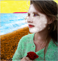
Then I remembered my research and dance remix covers often have an artistic element and so I used the diffuse glow filter on photoshop which I really, really liked as it gives it a more professional and retro feel.
Then I had the idea of creating a pop art effect by using lots of different colours which will catch the audience's attention. I painted in different sections of the image but I changed the opaque settings of the colours so that you can still see the image behind the colours, which I think particularly works on the ocean.
I gradually built up the colours until I only had the skin and hair left. However as you can see by my attempts below she ended up looking like someone out of Avatar so I had to have a rethink..
Blue
White
Pink
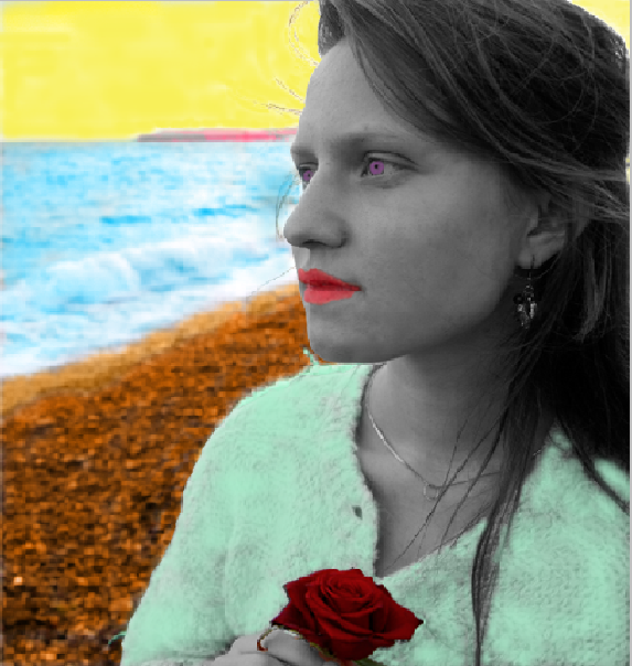
Then I had a brainwave to turn the artist black and white to contrast with the rest of the cover.
I liked this but I still wanted the bright red of the rose and so changed that as it it is symbolic of love and passion and so needs to be emphasised for the audience.
I also thought about still having some colour on the artist so I tried that out. 
I also re-did the eyes and lips but I'm not entirely sure it works yet.
I also tried out some fonts that might work...
There's still some work to do on these covers but I'm happy with my progress so far.

Monday, 7 November 2011

Interlude Feedback

Over the weekend I managed to get some feedback on my Interlude: Rough Cut. I posted on Facebook, asking for feedback:
Here are the replies...
As you can see there are a few conflicting answers, including some helpful advice which I will look at trying. I'm thinking of having it without lyrics except for maybe one or two to make a better impact (e.g. the 'tears' one). I will also try it in black and white to see if that works or not. 

Tuesday, 27 September 2011

Experimenting: Shot 2:25-2:27 (Cutaways and Transitions)

Whilst scouting the beach location, I also filmed a few shots to experiment with a few crucial visuals, including the 2:25-2:27 shot that leads out of the interlude.
I also looked at transitions that could be used and a few other shots that could be used as cutaways... 

Monday, 19 September 2011

Experimenting: Shot 1:50-58

When scouting locations this weekend I did some practice shots of one important shot in that location - 1:50-1:58, the introduction of the interlude. 
I have put together the video below to explain my process...